Once in a while I find myself reminiscing about my own wedding day. One of the key things we were quick to decide on was our wedding palette, which was actually based on a painting by Morandi (my husband’s favorite painter). Up until now, I am still constantly drawn to same colors, so I figured I better an inspiration board around it. This palette is like a stroll through a posh European garden at dusk when the light is the softest. The muted shades exude an understated sophistication that bring a certain level of maturity, while the array of colors still give it just enough vibrance. The gold accents, of course, complete the whole look by injecting a bit of luxury. Voila!
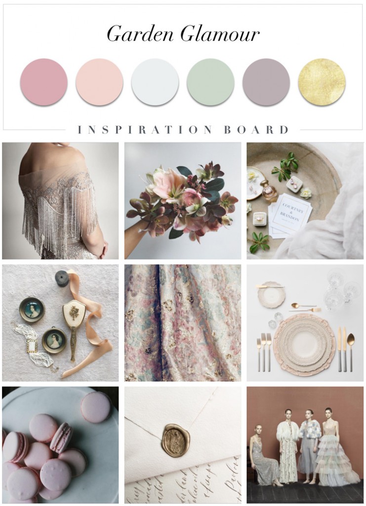
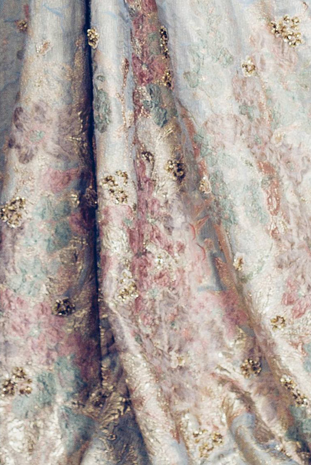
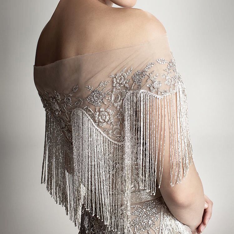
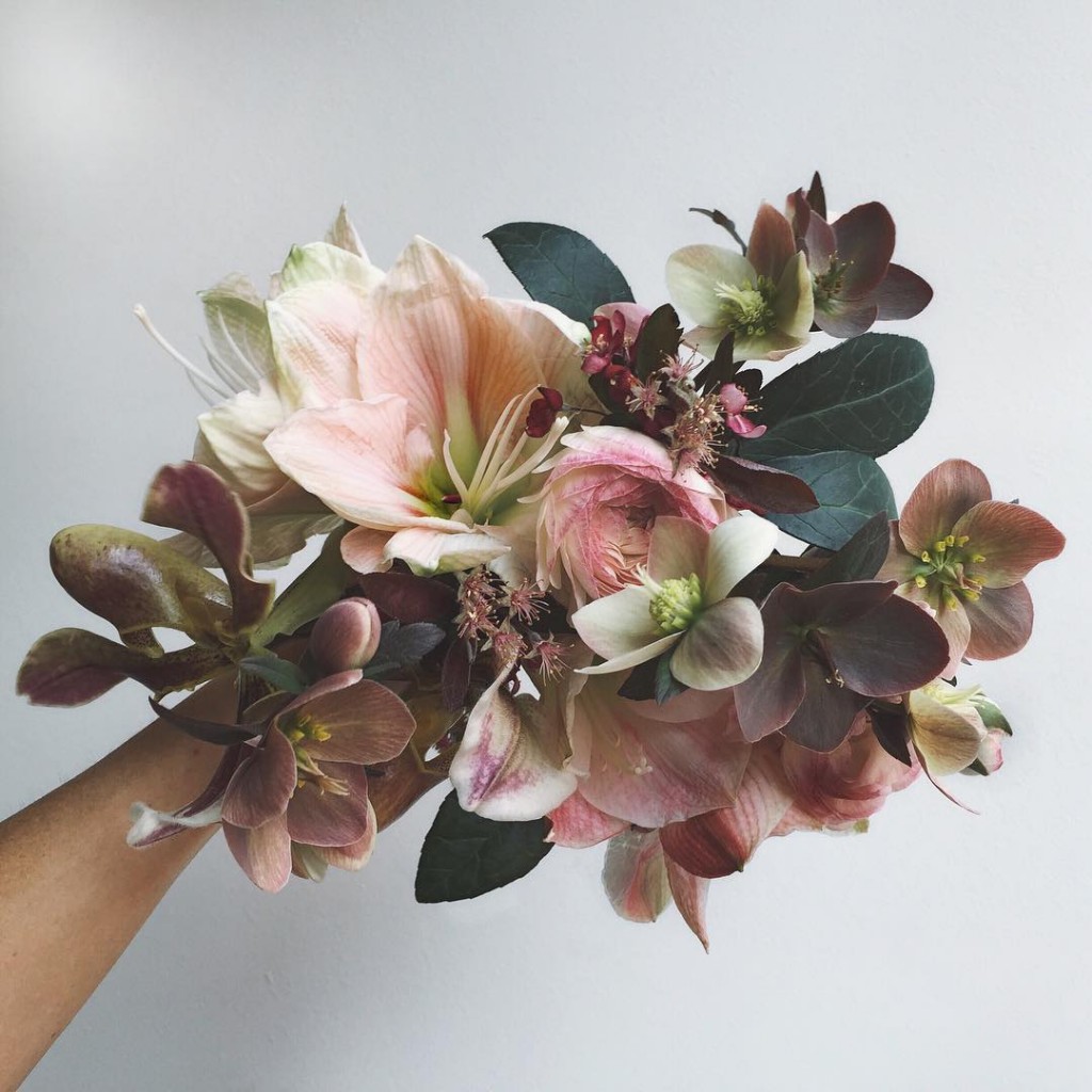
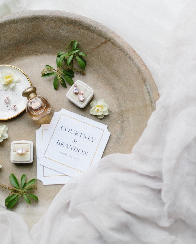
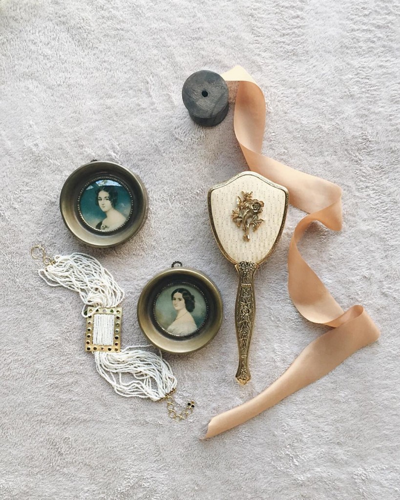
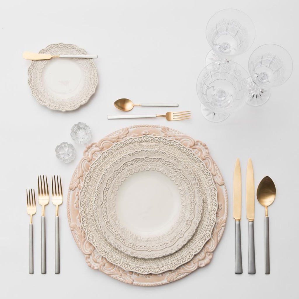
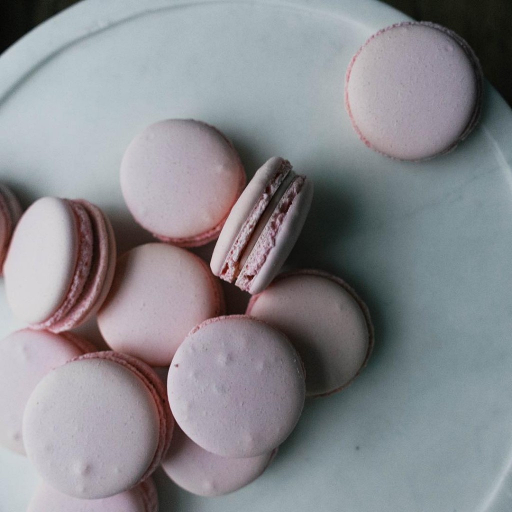
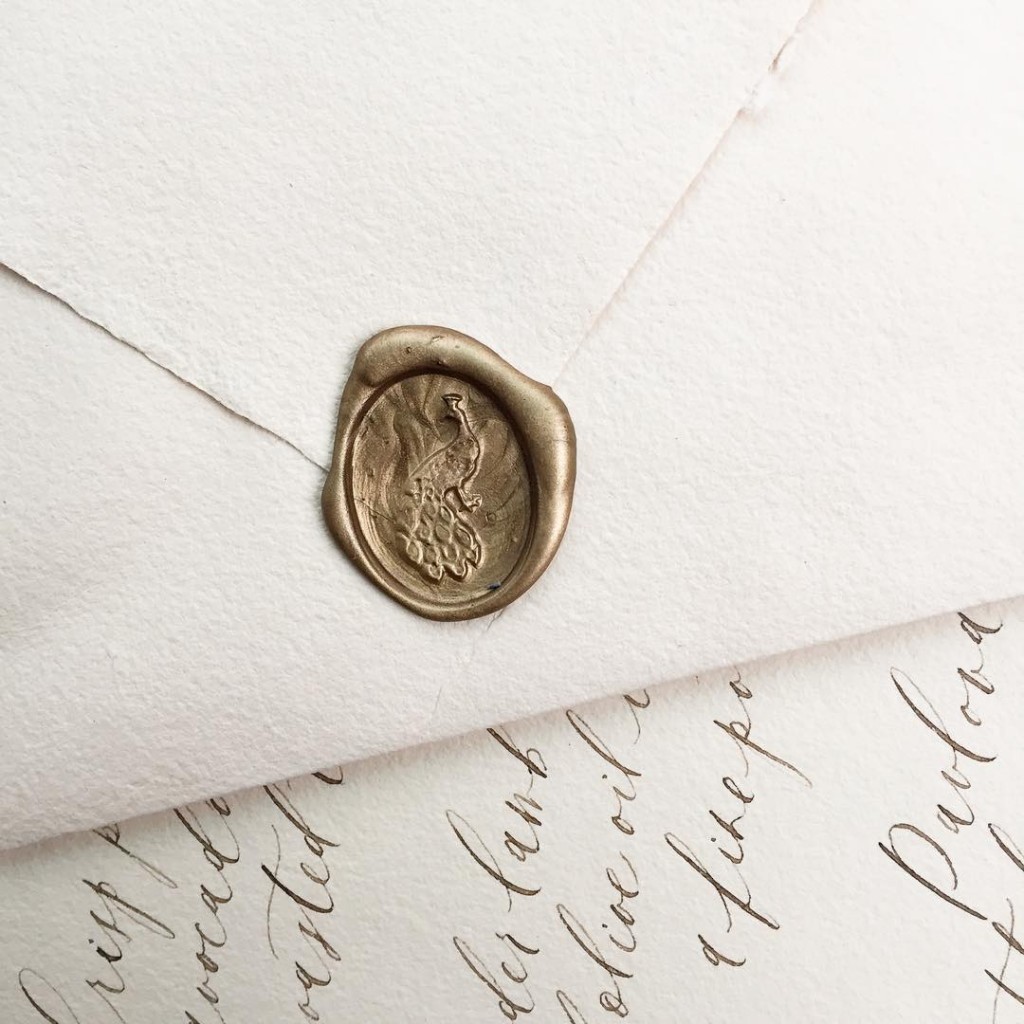
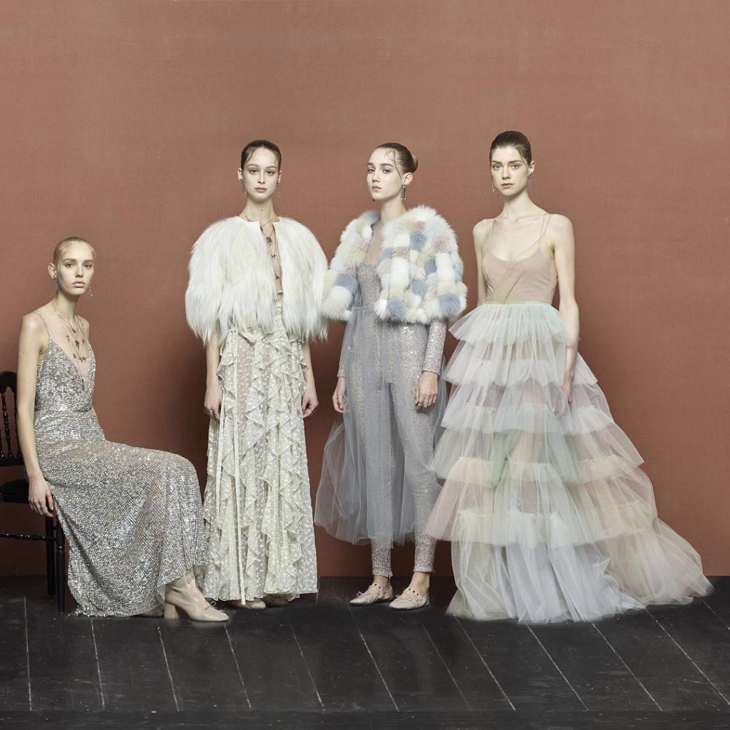
Image source: Alfazairy, Hamda Al Fahim, runningwildflorals, Luna de Mare, Casa De Perrin, sweetrootvillage, Aileen Fretz and Valentino